First UIX Project
Date: 01/15/2018
Core UX Project
Timeline: 2 Months
Project Description
The idea behind my first UIX project was to redesign the Telus Smart home experience. I felt that it was a limited and dated and poorly designed application and I wanted to try to improve it out of the gate.
I explored several novel ideas in this project like a digital key for guests, and live video chatting with a doorbell camera. I also explore some AI features but did not have the knowhow to map or design AI experiences at the time.
Relevance
As this is my first attempt at a UIX project I think its worth sharing. The project delineates a clear beginning of my UX education and a style of design which continues to run through my practice.
It also shows a dedication in my practice to explore novel ideas. There’s no reductivity I always want to make something at least in part new.
Contributors
Leo Felix
Introduction
The idea behind my first Product Design project was to improve the experience of one of my least favourite apps, the Telus smarthome app.
The project brief was to find an application that you thought could be easily improved and then to improve that app any way you think is best using product design research tools and mythologies.
My original thesis was to add a killer feature to the app, something that differentiated the Telus offering and made it stand out in the security space. That killer idea was virtual keys.
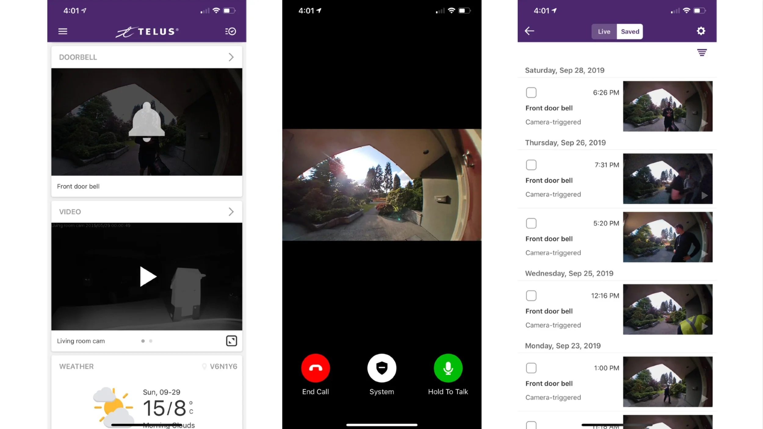
Telus Smarthome app.
I started by researching other app UI’s.
I broke them down into their parts to understand their design as best I could.
Then I looked at competition.
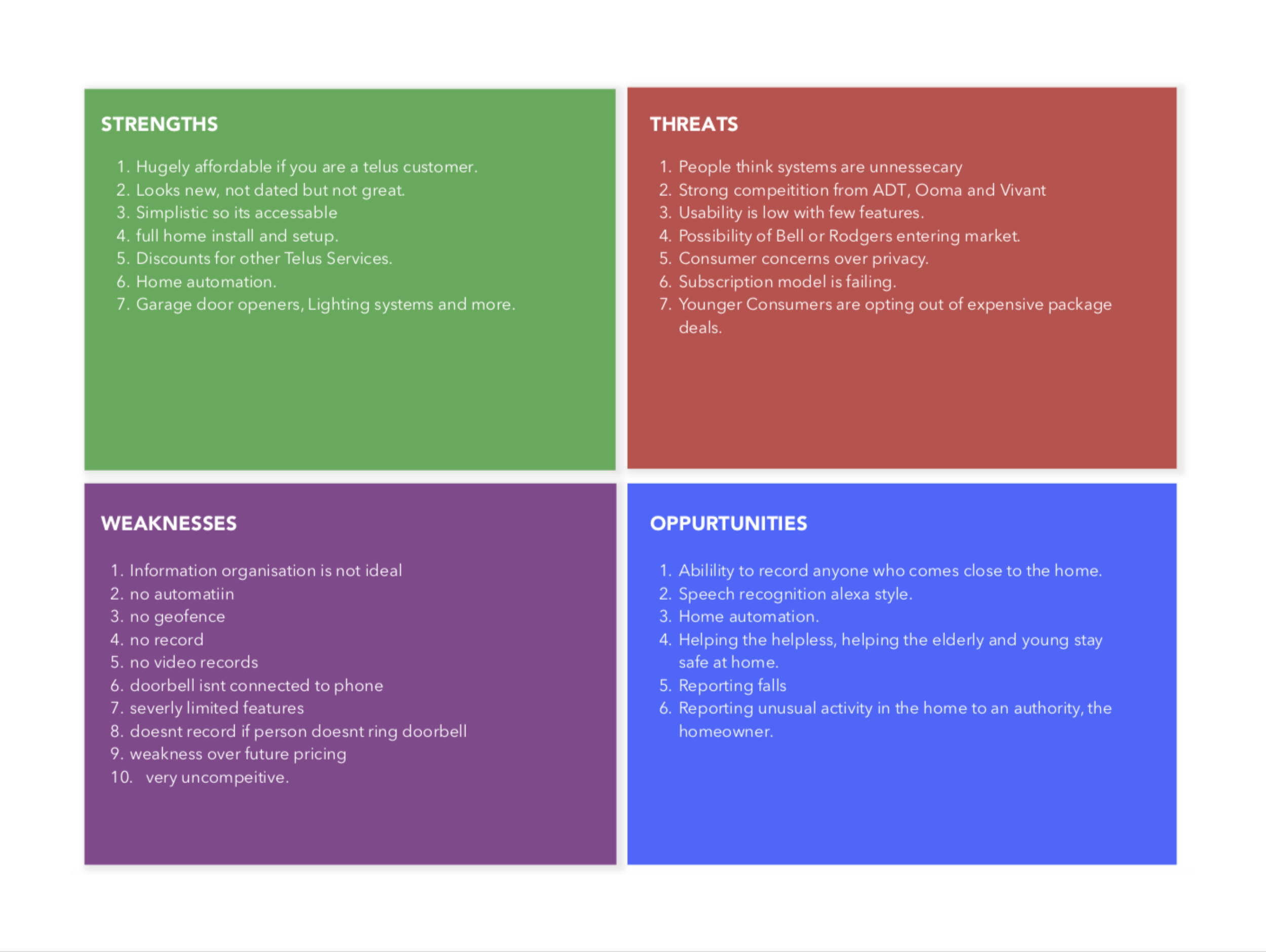
I conducted a SWOT analysis on the Telus app’s product market fit.
Then I created a few personas to illustrate the use cases with scenarios.
Then I identified weaknesses within the Telus software itself.
I looked at the problems I’m solving for these fictitious personas.
I used userflows to examine the how the Telus app worked in fine detail.
Wireframes
The next step in the process was to design some wireframes for the new software design with that killer feature.
These first wireframes added in the new features too the app landscape.
Here’s my thinking for the design of the new app.
Prototyping and testing
After I created a medium fidelity prototype I started user testing with classmates.
Finally I restyled the app to be more fun to see and use.
Final Design
Here’s the final design, a colorful futuristic app for sharing entrance links to your home.
I had to gloss over some changes and detailed to get to here, if you want to see the full process please feel free to download the process book.
There were some genuinely inventive ideas in this first attempt at product design.
Its clear that this was my first ever project in product design, there’s no doubt about that. From the formatting to the decision making and all of the above it shows. But thats why it’s archived here, to show the progression.
The idea of giving out portal keys, temporary access to a property via a link is still a cool concept, it’s like august on steroids. I think if I went back to redesign this today it could be a highly compelling product.
Early Work Timeline
The beginning of product design
20132020Up Next
Featured Project


